
An interesting interview over at the Huffington Post with Wesley Grubbs, one of the visual designers at Berkeley-based Pitch Interactive responsible for the infographic of drone strikes in Pakistan that was released on Monday and has since gone viral. I drew attention to it in my discussion of the geography of those strikes, but that dimension doesn’t appear in this otherwise compelling infographic (screenshot below). The project is called Out of Sight, Out of Mind – which certainly speaks to the politics of drone warfare – but it’s also out of site, and the geography of these strikes, as I tried to show, is not incidental to those politics.
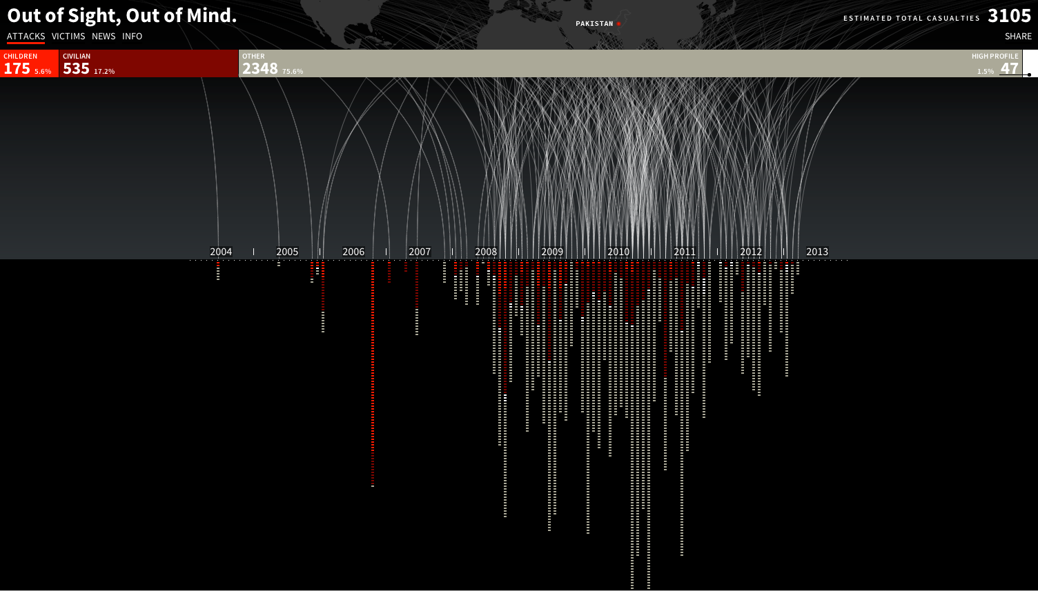
I think that the political-aesthetic effect of this visualization – which is considerable, otherwise why so much attention? The numbers aren’t new to anyone who’s followed the Bureau of Investigative Journalism‘s painstaking work – is bound up less with the raw numbers and more with those silver-grey arcs of light falling to the ground line: it’s a much more sobering (and I dare say thrilling) effect than a lifeless (sic) table. As I watch them descend, I’m drawn back to images of much earlier bombings, and the lights exploding against a velvet sky. And a visualization is doubly appropriate to a weapon that depends so much on visual apprehension – full-motion video feeds – and yet whose operation in the borderlands is shrouded in such semi-secrecy. Grubbs told the Bureau that their intention was ‘to cause people to pause for a moment and say “Wow I’ve never seen this in that light before”.’
The site is live – it will be updated in real time – and the same design group is intent on developing similar visualizations for drone strikes in Yemen and Somalia.
The Bureau’s work, the primary basis for the interactive, is so careful and considered that this attempt to downplay and even dismiss Pitch Interactive’s project is either simply ignorant or just plain silly. The author objects that the numbers ‘aren’t exact’ and wants to see the full spreadsheet – but the Bureau has made its detailed databases available and discussed their limitations in depth and detail: what better (‘exact’) sources does she have in mind? Perhaps she should try here.
I’m not sure that this is much better. Its author concludes: ‘Put simply, the visualization is implying that of 3,105 drone-strike casualties, only 47 are known to be legitimate kills. This is nonsense.’ Actually, what is nonsense is to misread and mis-represent the infographic in this way; what the website clearly says is that less than 2 per cent of the victims (a total of 47 people) have been ‘high profile targets’ (the original object of Sylvan Magnolia, the code-name for the covert war).
Not incidentally, less than twenty per cent of those killed in the strikes have been named, and the Bureau has just released a short video to crowd-source funding so that their raw numbers are finally turned into names:
You can donate here.

Pingback: Digital airstrikes and physical casualties | geographical imaginations
Pingback: Drone imaginaries | geographical imaginations
Reblogged this on Biometric State and commented:
Another post in what is now a fairly lengthy and strong series of contributions from Derek Gregory’s blog http://geographicalimaginations.com
Like the others, this is well worth a look. Although the discussion of Drone’s has increased, the sort of dialogue is generally not terribly rich, and in the US context, tends to be motivated by concerns over the (il)legality of killing US citizens and concerns over congressional and/or judicial oversight. As such, Gregory’s posts on this are welcome critical interventions about this ongoing issue.