
I’ve talked about charting armed conflict around the world before. Max Rosen has a series of data visualisations – ‘Our World in Data‘ – including several on war and peace. They include this one, drawn from multiple sources and collated (and designed) by the Hague Centre for Strategic Studies, showing global war deaths – the size of the bubble refers to the proportion of the world population killed:

There are of course all sorts of problems in this sort of exercise – calculating ‘war deaths’ is a political and intellectual minefield of its own – but you can find the sources used for the graphic here (click on the button on the right).
You can also download the Hague Centre’s graphics in a single pdf, ‘Peace and Conflict across time’, here (again, click on the button on the right): the display arranges the graphics into two sets – ‘Decline of Conflict’ and ‘Drivers of Peace’. No doubt Stephen Pinker would approve.
Max provides a more detailed analysis of conflicts post-1945 here, including this image (which extends only to 2004), and which is precisely the sort of thing that has licensed the debates over the decline of inter-state wars and the rise of (often transnational) ‘new wars’:
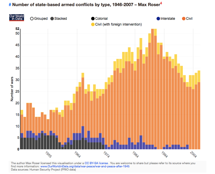
Before cheering the demise of inter-state war, however, we need to reflect on the multiple ways in which states and their advanced militaries are able to inflict violence by stealth (including cyber-attack), by proxy and by other other means (including economic warfare)…

Interesting stats! I didn’t realize how many civil wars there are every year. Thank you.