I’ve had several e-mails about maps of the conflict in Syria. For a quick introduction, a good place to start is Chatham House‘s interactive series here. It’s illuminating and impressive: scroll down and you’ll see what I mean.
Most press maps – including those in the Guardian and the New York Times – use multiple sources for their mapping projects, but most of them incorporate data from the IHS Conflict Monitor and the Institute for the Study of War.
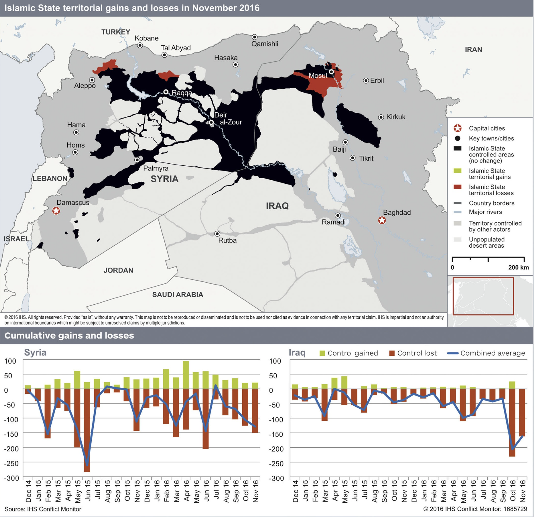
IHS Conflict Monitor, produced by IHS (Information Handling Services: Jane’s is a subsidiary), combines geospatial intelligence and social media monitoring. It’s been particularly effective in tracing the territorial extent of IS and other insurgent groups in Syria:
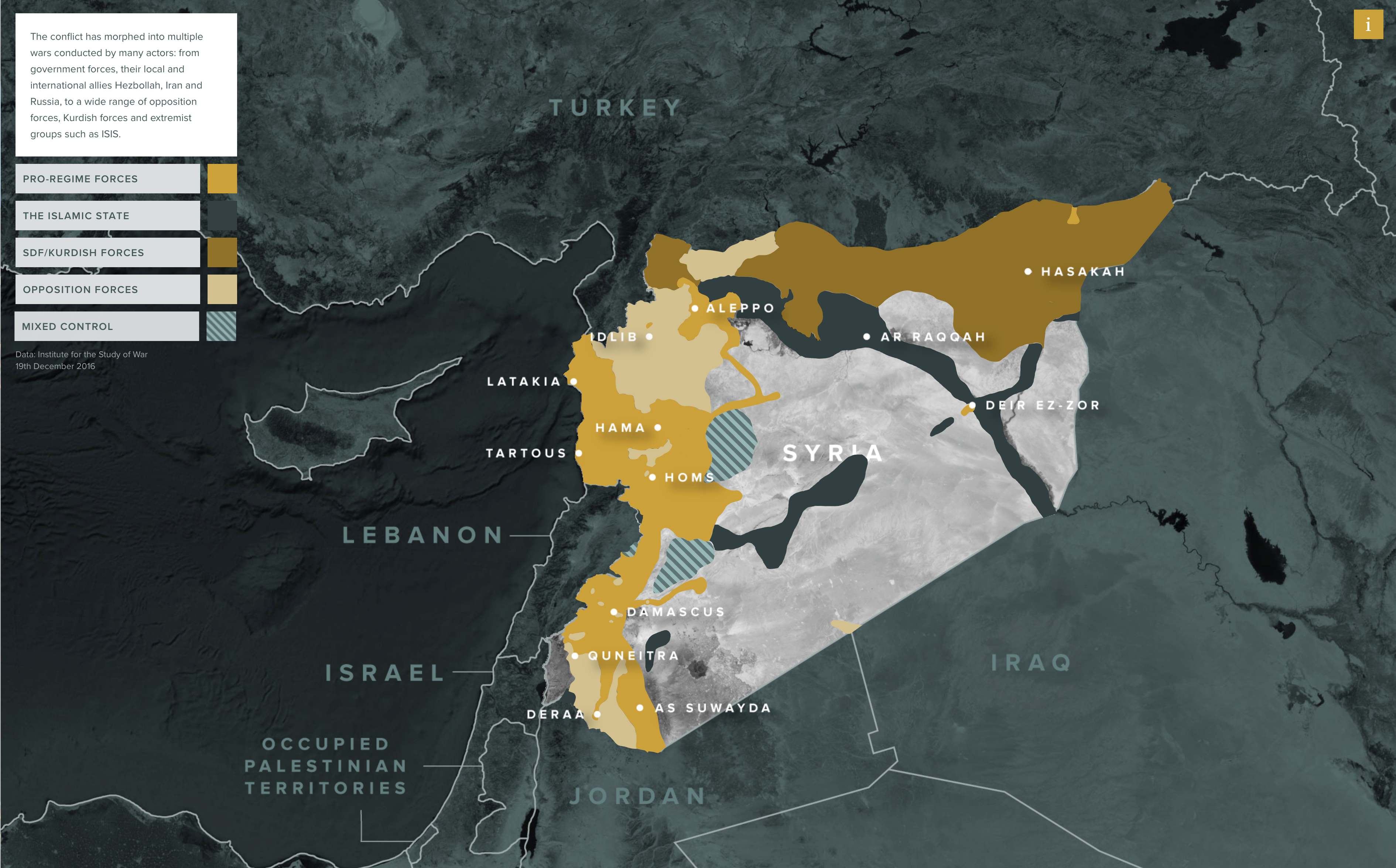
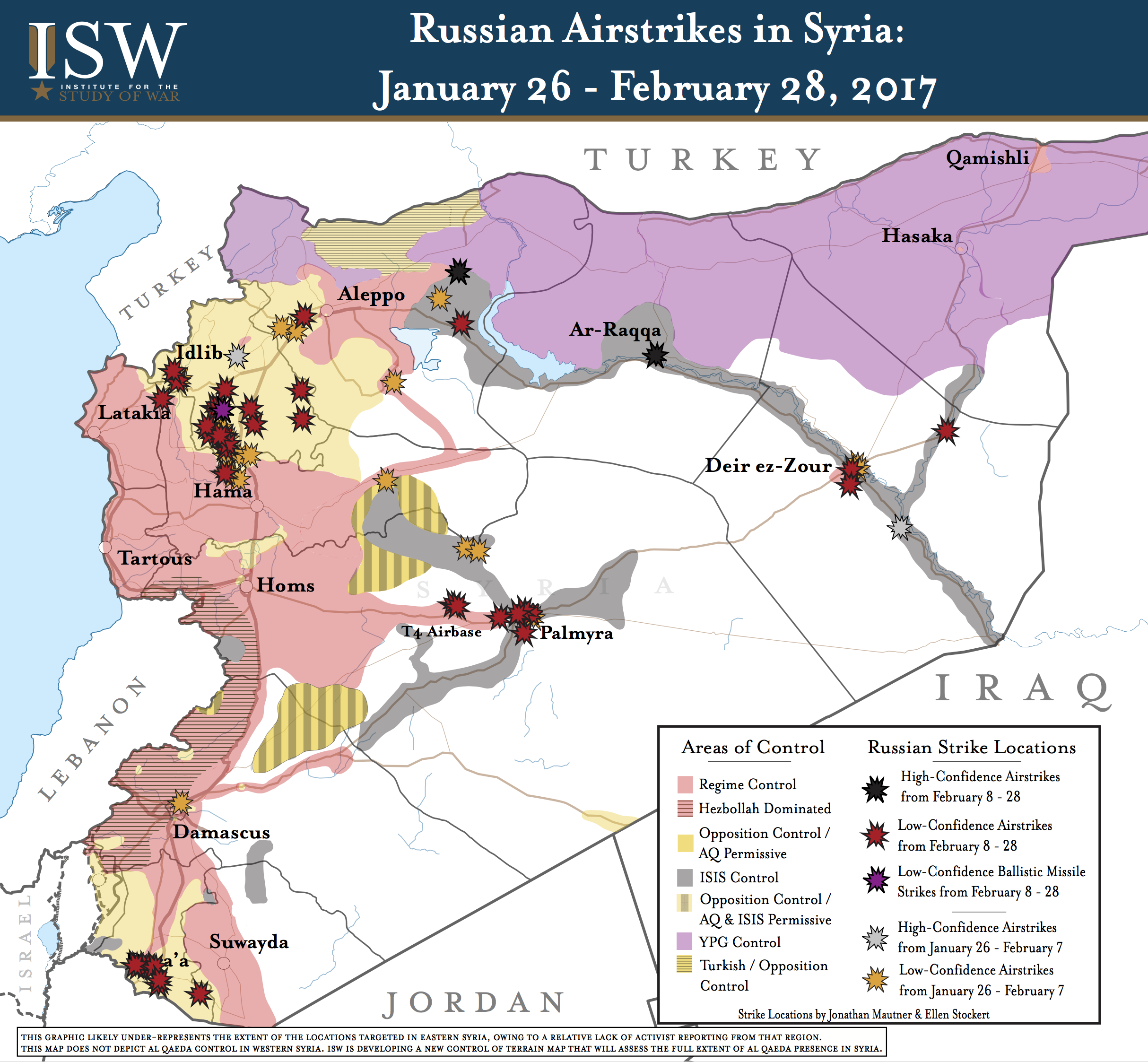
The credentials of the Institute for the Study of War are thoroughly neo-conservative (it was established by Kimberly Kagan in 2007), but its maps have drawn users of all stripes – and stars – to them: you can find an assessment by Evan Lewis at GeoCurrents here. The map below plots Russian airstrikes – for comparable data on US-led airstrikes you need Airwars – but what the press are usually most interested in is the background data on shifting areas of control.
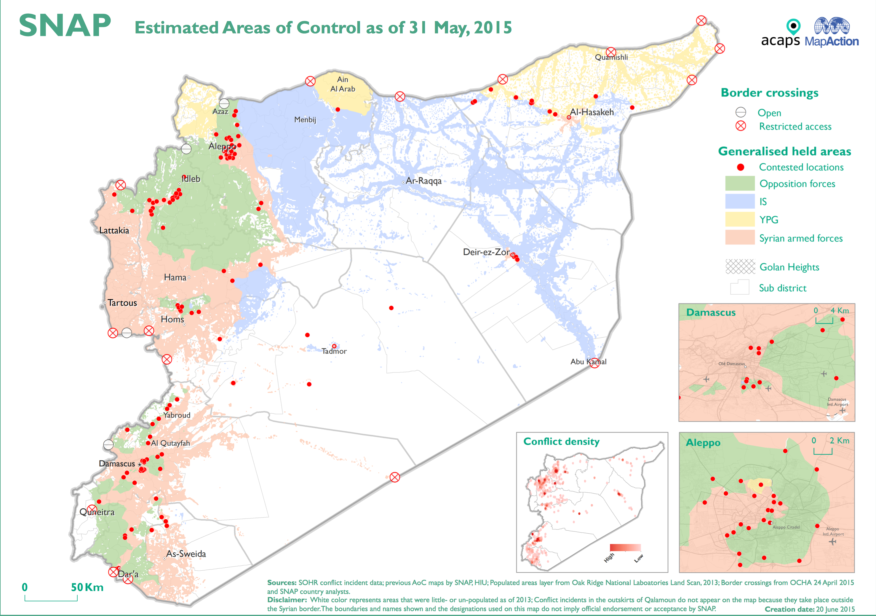
From December 2012 until it closed in June 2015 ACAP‘s Syria Needs Analysis Project (SNAP) also provided a series of maps plotting the changing areas of control:
Still ongoing, the Carter Center’s Conflict Resolution Program has an invaluable mapping project that issues weekly conflict reports:
Since 2012, the Syria Conflict Mapping Project has worked to analyze open source information related to the Syrian conflict in as much detail as possible, with the goal of assisting mediators and humanitarian responders. Using these publicly available resources, as well as regular consultations with stakeholders in the country, the Center has documented and mapped over 70,000 conflict events in Syria (including clashes, aerial bombardments, artillery shelling, etc.), the changing relations between thousands of armed groups, movements of internally displaced people, and humanitarian conditions.
Analyzed together, this information allows The Carter Center to provide mediators and humanitarian responders with up-to-date, detailed analysis on developments throughout Syria. Additionally, the Center maintains a near real-time, auto-updating map of areas of control throughout Syria. All of this information is analyzed and is shared directly with mediators and humanitarian organizations through a software tool provided by Palantir Technologies.
Regular readers (if not of this blog then of The Intercept) will detect the irony of the involvement of Peter Thiel‘s Palantir (for its enlistment in the NSA’s global surveillance, see here; for its function as the engine of Trump’s ‘deportation machine’, see here). But the Carter Centre’s maps are really helpful, not least for the historical sequence they provide, monthly from January 2015. I’ve grabbed a screenshot below, and you can access the full sequence here.

You wouldn’t guess it from the corporate-speak in the paragraph I quoted, but these maps draw heavily from social media too. As Kane Farabaugh explains:
Despite a gap in media coverage, a then-enterprising intern discovered reliable information was available, hiding in plain sight, due largely to the fact the Syrian conflict unfolded in a part of the world where many are connected, digitally.
“Syrians, and people in the Middle East in general, are two to four times more likely to share information about politics, and religious views online,” said that former intern, Christopher McNaboe, citing a Pew Research Center study on social media habits of those living in the Middle East.
“In the case of Syria, there’s just too much. Videos, Facebook posts, tweets, blogs, photos, you name it…Syrians are very active and passionate about getting information out,” he said….
“The information available online ranges anywhere from political statements, and defections, and armed group formations, to footage of the actual fighting, and humanitarian relief efforts; you name it,” says McNaboe.
“I think the Syrian conflict represents a major paradigm shift, a major change in the way in which conflict plays out,” he adds. “Previous conflicts did not take place in connected environments like Syria. There wasn’t YouTube. There wasn’t Twitter.”
Finally, over at the National Geographic Gael Cérez and Chris O’Brien provide an illuminating survey of several online cartographers (Cartography 2.0 in action) – including the remarkable Robert Cross, one of the founders of the Institute for United Conflict Analysts – and append a list noting those cartographers who are ‘pro-rebel’, ‘pro-government’ and ‘pro-Kurd’. More on crowd-sourcing maps of the conflict from Aleszu Bajek here.
