Googling military occupation

A new report from the Arab Center for Social Media Advancement, Mapping Segregation: Google Maps and the Human Rights of Palestinians, adds another dimension to contemporary discussions about the weaponisation of social media (and, not incidentally, about Google’s claims of social responsibility).

The report outlines the restrictions imposed by the illegal Israeli occupation of the West Bank on Palestinians, and compares three cartographic apps: Google Maps, Maps.me and Waze.  The focus is on what is missing from their digital maps – the misrepresentation or erasure of Palestinian villages (though illegal Israeli colonies are clearly marked) – and the cartographic attenuation of the all-too-real restrictions on the movement of Palestinians.  For example:

On routes within the West Bank, Google Maps prioritizes directing users through Israel rather than through the West Bank, even if this adds considerable distance to the journey. The drive from Ramallah to Nablus through the West Bank usually takes 45 minutes, however when using Google Maps, the journey takes a long route through Israel and takes 4.5 hours. In contrast, the shortest route from Ramallah to Bethlehem takes the driver through Jerusalem, which is inaccessible for Palestinian West Bank ID holders. Whenever a route passes through the West Bank, Google Maps shows two warnings on the route description: “This route has restricted usage or private roads” and “This route may cross country borders” and fails to highlight Israeli settlements or checkpoints. Google Maps is unable to calculate routes within Palestinian rural communities, or to and from Gaza, displaying the message “Sorry, we could not calculate driving/walking directions from x to y”. The app offers the option to “add a missing place” and edit information, but this “might take some time to show up on the map” as they must be reviewed first.

More from +972 magazine here.

If you haven’t done this before, try putting “Palestine” into the search box on Google Maps: the report discusses that too.

Conflict Urbanism

I’m in Copenhagen – and still bleary-eyed – for a symposium organised by my good friends Kirsten Simonsen and Lasse Koefoed at Roskilde on their current project  ‘Paradoxical spaces: Encountering the other in public space‘.  I’ll be talking about the war in Syria, drawing on my previous work on attacks on hospitals, healthcare workers and patients (see ‘Your turn, doctor‘) – which I’ve now considerably extended as I work on turning all this into  a longform essay: I’ll post some updates as soon as I can – but now adding a detailed discussion of siege warfare in Syria.  More on that in my next post; but for now I wanted to share some remarkable work on Aleppo by Laura Kurgan and her students at the Center for Spatial Research at Columbia:

Conflict Urbanism: Aleppo is a project in two stages.

First, we have built an open-source, interactive, layered map of Aleppo, at the neighborhood scale. Users can navigate the city, with the aid of high resolution satellite imagery from before and during the current civil war, and explore geo-located data about cultural sites, neighborhoods, and urban damage.

Second, the map is a platform for storytelling with data. We are inviting collaborators and students to bring new perspectives and analyses into the map to broaden our understanding of what’s happening in Aleppo. Case studies will document and narrate urban damage — at the infrastructural, neighborhood, building, social, and cultural scales — and will be added to the website over time.

We invite ideas and propositions, and hope to build on the data we have compiled here to create an active archive of the memory of destruction in Aleppo through investigation and interpretation, up close and from a distance.

That last phrase is an echo of Laura’s book, Close Up at a Distance: Mapping, Technology and Politics, published by MIT in 2013.  The new project emerged out of a seminar taught by Laura in 2016:

Students worked collaboratively to develop a series of case studies using a map developed by the Center for Spatial Research, specifically designed to research urban damage in Aleppo during the ongoing civil war. Their work incorporates a range of disciplines, methods and results. Each student was asked to create case studies and add layers to the existing map. The results — spatializing youtube video, interior borders between fighting factions, imagining urban survival during wartime, imaging escape routes, audio memory maps, roads, water, hospitals, informal neighborhoods, religion, communications infrastructure, and refugee camps at the borders — are [available online here].

I’m particularly taken by ‘Spatializing the YouTube War’.   One of the challenges for those of us who follow these events ‘at a distance’ is precisely how to get ‘close up’; digital media and the rise of citizen journalism have clearly transformed our knowledge of many of today’s conflict zones – think, for example, of the ways in which Forensic Architecture has used online videos to narrate and corroborate Russian and Syrian Arab Air Force attacks on hospitals in rebel-held areas Syria; similarly, Airwars has used uploaded videos for its painstaking analysis of US and coalition airstrikes and civilian casualties (see this really good backgrounder by Greg Jaffe on Kinder Haddad, one of the Airwars team, ‘How a woman in England tracks civilian deaths in Syria, one bomb at a time) – and I’ve used similar sources to explore the effects of siege warfare on Aleppo, Homs and Madaya.

Here is how Laura and her students – in this case, Nadine Fattaleh, Michael James Storm and Violet Whitney describe their contribution:

The civil war in Syria has shown how profoundly the rise of cellphones with video-cameras, as well as online video-hosting and emergent citizen journalism, has changed the landscape of war documentation. YouTube has become one of the largest sources (and archives) of information about events on the ground in Syria: since January 2012 over a million videos of the conflict there have been uploaded, with hundreds of millions of views to date. Major news agencies have come to rely on YouTube as a primary source for their reporting, and human rights organizations often cite videos as part of their advocacy and documentation efforts. This independently reported footage has created a new powerful archive, but opens up crucial questions of credibility, verification, and bias. As with all data, every video comes to us bearing the traces of the situation and intentions that motivated its production. This does not disqualify it – quite to the contrary – but it does demand that we approach everything critically and carefully.

We set out to investigate YouTube as archive of the Syrian uprising and to develop a method for organizing that archive spatially. We used the frameworks that we had developed for the Conflict Urbanism Aleppo interactive map, together with a naming convention used by Syrian civic media organizations, in order to sort and geolocate YouTube videos from multiple sources. We then produced a searchable interactive interface for three of the most highly cited YouTube channels, the Halab News Network, the Aleppo Media Center, and the Syrian Civil Defense. We encourage journalists, researchers, and others to use this specifically spatial tool in sorting and searching through the YouTube dataset.

The Halab News Network [above] shows a wide distribution of videos across the city, including the city center and government-held Western side of the city. The Eastern half of the city — in particular the Northeastern neighborhoods of ash-Sha’ar (الشعار), Hanano (هنانو), and Ayn at-Tal (عين التينة) – is the best-documented.

In contrast:

The videos published by the Aleppo Media Center [above] roughly follow the formerly rebel-held Eastern side of the city, with a small number of videos from the central and Western areas. The highest number of videos is in the neighborhood of ash-Sha’ar (الشعار). Particular spots include ash-Sha’ar (الشعار), coverage of which is shared with the Syrian Civil Defense. Another notable concentration are two neighborhoods in the Southwest, Bustan al-Qaser (بستان القصر) and al-Fardos (الفردوس).

They also analyse the video geography produced by the White Helmets [below]: ‘The Syrian Civil Defense, also known as the White Helmets, have uploaded videos primarily in the formerly rebel-held Eastern and Southern areas of Aleppo. Only the Western area of ash-Shuhada’ (الشهداء) falls outside of this trend.’

This, like the other collaborative projects under the ‘Conflict Urbanism’ umbrella, is brilliant, essential work, and we are all in their debt.

You can read more about the project in a short essay by Laura, ‘Conflict Urbanism, Aleppo: Mapping Urban Damage’, in Architectural Design 87 (1) (2017) 72-77, and in another essay she has written with Jose Francisco Salarriaga and Dare Brawley, ‘Visualizing conflict: possibilities for urban research’, open access download via Urban Planning 2 (1) (2017) here [this includes notice of a parallel project in Colombia].

Mapping Syria

I’ve had several e-mails about maps of the conflict in Syria.  For a quick introduction, a good place to start is Chatham House‘s interactive series here.  It’s illuminating and impressive: scroll down and you’ll see what I mean.

Most press maps – including those in the Guardian and the New York Times – use multiple sources for their mapping projects, but most of them incorporate data from the IHS Conflict Monitor and the Institute for the Study of War.

IHS Conflict Monitorproduced by  IHS (Information Handling Services: Jane’s is a subsidiary), combines geospatial intelligence and social media monitoring.  It’s been particularly effective in tracing the territorial extent of IS and other insurgent groups in Syria:

The credentials of the Institute for the Study of War are thoroughly neo-conservative (it was established by Kimberly Kagan in 2007), but its maps have drawn users of all stripes  – and stars – to them: you can find an assessment by Evan Lewis at GeoCurrents here.  The map below plots Russian airstrikes – for comparable data on US-led airstrikes you need Airwars – but what the press are usually most interested in is the background data on shifting areas of control.

From December 2012 until it closed in June 2015 ACAP‘s Syria Needs Analysis Project (SNAP) also provided a series of maps plotting the changing areas of control:

Still ongoing, the Carter Center’s Conflict Resolution Program has an invaluable mapping project that issues weekly conflict reports:

Since 2012, the Syria Conflict Mapping Project has worked to analyze open source information related to the Syrian conflict in as much detail as possible, with the goal of assisting mediators and humanitarian responders. Using these publicly available resources, as well as regular consultations with stakeholders in the country, the Center has documented and mapped over 70,000 conflict events in Syria (including clashes, aerial bombardments, artillery shelling, etc.), the changing relations between thousands of armed groups, movements of internally displaced people, and humanitarian conditions.

Analyzed together, this information allows The Carter Center to provide mediators and humanitarian responders with up-to-date, detailed analysis on developments throughout Syria. Additionally, the Center maintains a near real-time, auto-updating map of areas of control throughout Syria. All of this information is analyzed and is shared directly with mediators and humanitarian organizations through a software tool provided by Palantir Technologies.

Regular readers (if not of this blog then of The Intercept) will detect the irony of the involvement of Peter Thiel‘s Palantir (for its enlistment in the NSA’s global surveillance, see here; for its function as the engine of Trump’s ‘deportation machine’, see here).  But the Carter Centre’s maps are really helpful, not least for the historical sequence they provide, monthly from January 2015.  I’ve grabbed a screenshot below, and you can access the full sequence here.

You wouldn’t guess it from the corporate-speak in the paragraph I quoted, but these maps draw heavily from social media too.  As Kane Farabaugh explains:

Despite a gap in media coverage, a then-enterprising intern discovered reliable information was available, hiding in plain sight, due largely to the fact the Syrian conflict unfolded in a part of the world where many are connected, digitally.

“Syrians, and people in the Middle East in general, are two to four times more likely to share information about politics, and religious views online,” said that former intern, Christopher McNaboe, citing a Pew Research Center study on social media habits of those living in the Middle East.

“In the case of Syria, there’s just too much. Videos, Facebook posts, tweets, blogs, photos, you name it…Syrians are very active and passionate about getting information out,” he said….

“The information available online ranges anywhere from political statements, and defections, and armed group formations, to footage of the actual fighting, and humanitarian relief efforts; you name it,” says McNaboe.

“I think the Syrian conflict represents a major paradigm shift, a major change in the way in which conflict plays out,” he adds. “Previous conflicts did not take place in connected environments like Syria. There wasn’t YouTube. There wasn’t Twitter.”

Finally, over at the National Geographic Gael Cérez and Chris O’Brien provide an illuminating survey of several online cartographers (Cartography 2.0 in action) – including the remarkable Robert Cross, one of the founders of the Institute for United Conflict Analysts – and append a list noting those cartographers who are ‘pro-rebel’, ‘pro-government’ and ‘pro-Kurd’.  More on crowd-sourcing maps of the conflict from Aleszu Bajek here.

Deconstructing the map

515-00-wcbl-_sx331_bo1204203200_In the wake of the Trump administration’s shock at the non-existent Bowling Green Massacre, its fabricated comments on immigrants, refugees and crime in Sweden (for the record, I’ve been to Rinkeby in the company of Nordic geographers, and I also have Allan Pred‘s brilliant Even in Sweden on my shelves: and I’d also recommend Gavan Titley‘s elegant ‘Swedens of the mind‘ over at Critical Legal Thinking), and – in spectacular contrast – Trump’s sullen silence over attacks on immigrants, refugees and Muslims that did happen,  The Bureau of Investigative Journalism has just published an important and incisive take-down of a map that went viral (the mot juste) in 2016.

Its reporters explain:

Last year, an anonymously-produced map started to make its way around German social media. It claimed to show viewers the spread of “refugee and migrant crime” throughout Germany.

Unlike some of the lurid tales of migrant depravity that have circulated in Germany in recent months and turned out to be false, the interactive map seemed professionally put together. Each pin on it correlated to a police or media report of a crime (“we don’t document cases simply on the basis of hearsay”, its makers claimed).

The map, called XY-Einzelfall (a sarcastic riposte to the idea each migrant crime is simply an ‘isolated case’ – Einzelfall in German) was viewed more than four million times.

screen-shot-2017-02-26-at-14-12-15

One of the XY-Einzelfall (XYE) social media followers tweeted over 80 times as new crimes were added to the map: “The time’s coming when Germans will need to carry guns for self-protection.”

But analysis of the map’s methodology by the Bureau of Investigative Journalism shows that it is systematically misleading, often attributing crimes to migrants or refugees on the basis of nothing more than a witness statement that the perpetrator was “dark-skinned” or “southern”. On top of this, the project vastly overstates the figures on migrant crime through skewed use of statistics.

Tracing the map’s presence on social media also shows it to be far from politically neutral. An account in XYE’s name on the Russian social media site VKontakte is rife with the kind of pro-Trump pro-Putin memes which have become the signature of the global alt-right. These are also the dominant affiliations of the Twitter accounts promoting the map. Overtly racist and xenophobic memes are also commonplace.

Most readers – especially those familiar with the stream of work set in motion by Brian Harley – will not be surprised to find that the map’s authors summon the supposed objectivity and facticity of cartography as a legitimating device:

The map’s creators like to portray their approach as scientific, mimicking the language of academics and think tanks. In January they released a “7-day analysis of published police reports”, with a breakdown of crimes by groups of different origins and a headline suggesting that 84% of crimes were committed by migrants.

In fact, the 84% figure is completely misleading. The map makers have stripped out all crimes in which the perpetrators’ background is not mentioned from their calculation. The true percentage of crimes in this period committed by migrants – according to XYE’s own data – is 13%. There is a further 13% of crimes which the XYE say are ‘probably’ committed by migrants.

We looked at how XYE decide that each pin on the map represents a crime which could have been committed by migrants. They comb police and media reports and pull out descriptions of perpetrators. We found that almost two-thirds of their reported offenders fell into the categories of “dark-skinned”, “southern-looking”, “foreigner” or “refugee”.

We then selected a random sample of 100 reports within each of these four categories for closer analysis. We found that in nearly all cases where the perpetrator was described as “dark-skinned” or “southern”, there was no evidence in the sources positively identifying them as a migrant or refugee. This was also true of the overwhelming majority of cases where the offender was described as a “foreigner”.

I’m en route to Vancouver, so forgive the brevity of this notice of such an important issue.

Counter-mapping and ecologies of military power

ecologies-of-power

Just caught up with Ecologies of Power by Pierre Bélanger and Alexander Arroyo (MIT Press), which – as the subtitle reveals – is a fascinating countermapping of the Pentagon’s logistical landscapes and military geographies:

This book is not about war, nor is it a history of war. Avoiding the shock and awe of wartime images, it explores the contemporary spatial configurations of power camouflaged in the infrastructures, environments, and scales of military operations. Instead of wartime highs, this book starts with drawdown lows, when demobilization and decommissioning morph into realignment and prepositioning. It is in this transitional milieu that the full material magnitudes and geographic entanglements of contemporary militarism are laid bare. Through this perpetual cycle of build up and breakdown, the U.S. Department of Defense –the single largest developer, landowner, equipment contractor, and energy consumer in the world – has engineered a planetary assemblage of “operational environments” in which militarized, demilitarized, and non-militarized landscapes are increasingly inextricable.

In a series of critical cartographic essays, Pierre Bélanger and Alexander Arroyo trace this footprint far beyond the battlefield, countermapping the geographies of U.S. militarism across five of the most important and embattled operational environments: the ocean, the atmosphere, the highway, the city, and the desert. From the Indian Ocean atoll of Diego Garcia to the defense-contractor archipelago around Washington, D.C.; from the A01 Highway circling Afghanistan’s high-altitude steppe to surveillance satellites pinging the planet from low-earth orbit; and from the vast cold chain conveying military perishables worldwide to the global constellation of military dumps, sinks, and scrapyards, the book unearths the logistical infrastructures and residual landscapes that render strategy spatial, militarism material, and power operational. In so doing, Bélanger and Arroyo reveal unseen ecologies of power at work in the making and unmaking of environments—operational, built, and otherwise—to come.

orbital-urbanization

Here is the legendary Claude Raffestin on the project:

Among its remarkable achievements, Ecologies of Power offers a new way of analyzing and representing the complex apparatus commonly called ‘war’ through its military infrastructures, logistical territories, and the material, energetic, informational, and financial flows that make and move through them. Deftly traversing a multitude of scales and landscapes, the book mobilizes a vast body of transdisciplinary work on the complex subject of power and its modes of spatial and semiotic representation. This ambitious and long-awaited volume is an essential reference for all scholars across the arts and sciences whose work aims to rethink how we engage—and disengage from—contemporary forms of conflict.

You can get an illustrated preview from Regine at We make money not war here.  She lists the book’s five core case studies:

  • The first case study is Diego Garcia, an atoll in the Indian Ocean. Strategically located between East Africa, the Middle East and Southeast Asia, the atoll is a vital anchor for the Afghanistan campaign and for supplying US naval forces with fuel.

fuel-chain

  • A second case looks at the high number of blast trauma and death from improvised explosive devices in the Helmand Valley and investigates the intimate connections between the use of IED by local groups and the production and movements of opium.
  • The third case study… looks at nutritional politics and at DoD’s surveys of rare earths and other high-volume minerals in the territories the U.S. attempts to control.
  • A fourth case study explores the complexities and ‘indeterminacies’ inherent to technological systems such as drones.
  • The last case study zooms in on Washington D. C.’s landscape of defense apparatus.

The images I’ve used here are from the Graham Foundation‘s webpage on the project.

Data.mil

Four years ago I described Project THOR (Theatre History of Operations Reports), Lt Col Jenns Robertson‘s remarkable attempt to transcribe, standardise and integrate the available records of US Air Force strike missions – see here (scroll down) and (especially) here.

His databases have now been incorporated into Defense Digital Service‘s  data.mil, described as ‘an attempt in open defence data’: it’s also an experiment, which invites not only use but interaction and comment.  You can now access the THOR databases – and find the backstory – here.

In 2006, Lt Col Jenns Robertson and his team in the Pentagon faced a daunting task. Every week, the Air Force’s Chief of Staff and other senior military officers would ask for the latest on the air war in Iraq and Afghanistan – how many aircraft had flown that week, which ground units they supported, and what munitions they had dropped.

Working in the Air Force’s Operations Directorate, Robertson had access to a wide array of classified data sources, yet the weekly report was tedious to produce.  Data was not easily searched and often contained only half the picture, forcing Robertson’s team to assemble the report manually every week over the course of several days. He knew there was an easier way.

In his spare time, Robertson began creating the Theater History of Operations Reports (THOR), initially a simple Excel spreadsheet that eventually matured into the largest compilation of releasable U.S. air operations data in existence. Robertson tested his database with his team, asking them to generate the Chief’s weekly report twice — once manually, and again using THOR. The result was impressive: THOR cut the report work from three days to just under an hour.

After receiving Department of Defense approvals, Robertson was able to post THOR files online so interested public citizens could search the data for their own purposes. Robertson understands the vast potential benefits of opening such a large compilation of previously inaccessible data to the public. “I can’t envision all the ways this can be used”.

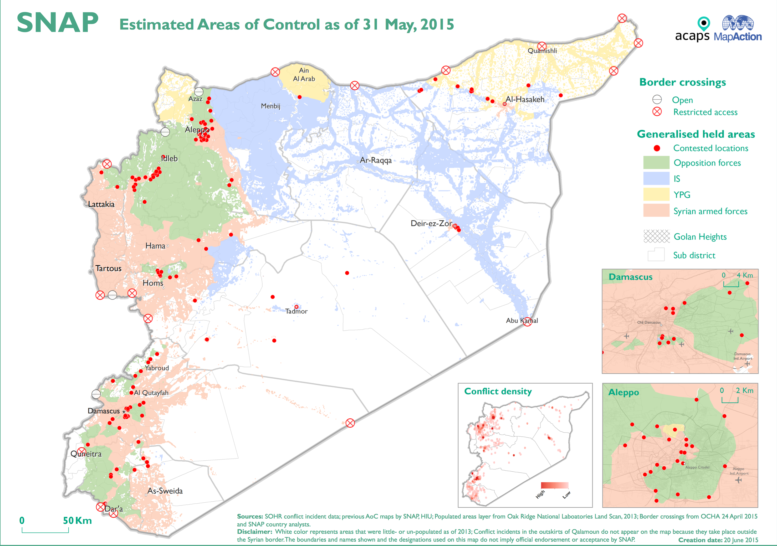
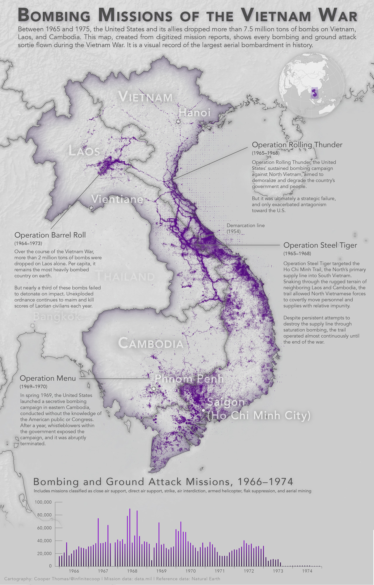
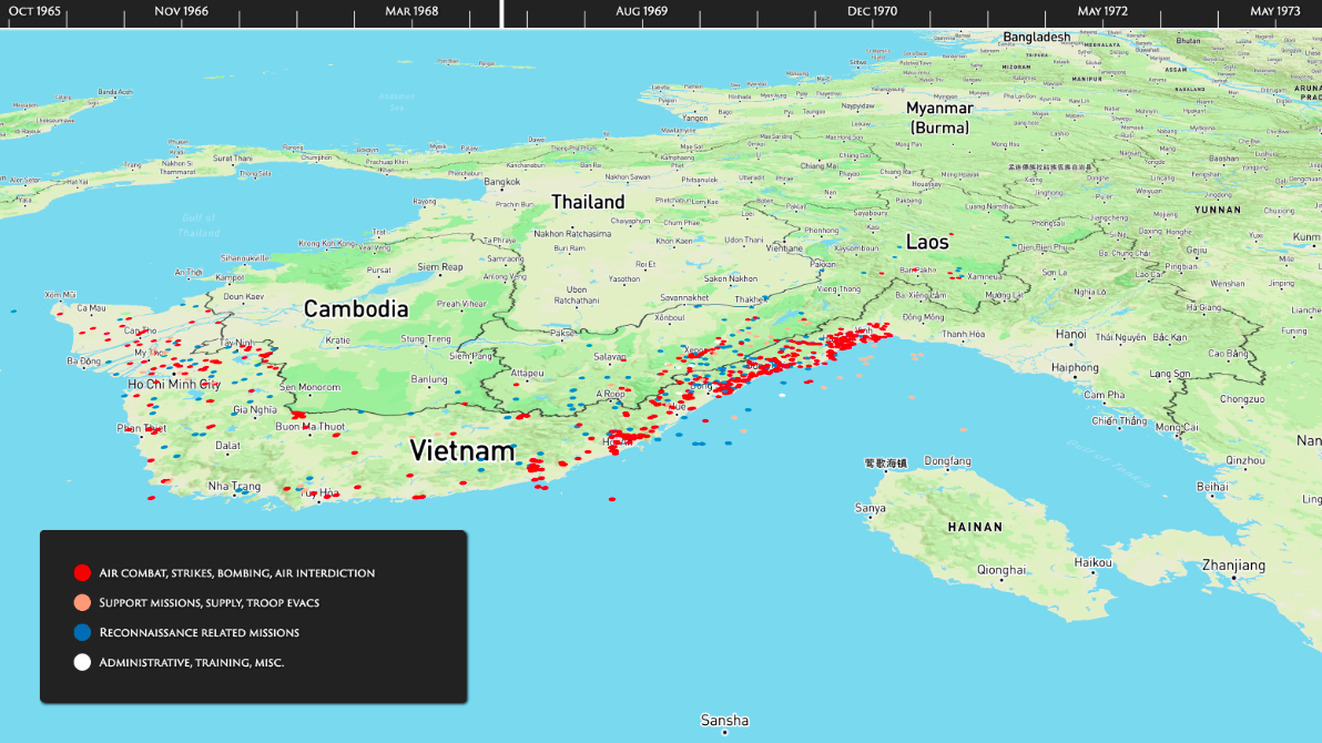
One of the first (once forbidden) fruits of releasing this data to the public is a remarkable map by Cooper Thomas plotting 3.1 million US bombing and ground attack missions (including Close Air Support and aerial interdiction) in North and South Vietnam, Laos and Cambodia between 1966 and 1974:

vietnamwarbombing-01

Cooper promises further explorations of this and other THOR databases; if you know of any others, please let me know [see UPDATE below].

Data.mil is promising to release a new ‘data story’ each month – next month should see the release of a military casualty database.  The site went live in December 2016, and  Mary Lazzeri and Major Aaron Capizzi explain the background:

Mary:  Major Aaron Capizzi, USAF had the idea to use open data principles to solve Department of Defense (DoD) problems after attending a panel discussion at the Harvard Kennedy School sponsored by former Deputy CTO, Nick Sinai. In addition, I had been looking to seed an open data effort at DoD. Aaron’s idea, coupled with the opportunity to present the Theater History of Operations (THOR) bombing data in a new and interesting way, provided a perfect opportunity to put energy behind the effort.

We’re looking to use this pilot to jumpstart a larger open data effort at DoD. The beta site is a working proof-of-concept. The next step is to show the larger DoD community that open data merits investment.

Aaron: Our approach is unique in two ways. First, Data.mil will test various ways of sharing defense-related information, gauging public interest and potential value, while protecting security and privacy. We will quickly iterate and improve the data offerings on data.mil, using public feedback and internal department discussions to best unlock the value of defense data. Our goal is to provide all data with enough context that users, both the public and defense employees, can understand the potential value and get started using data quickly.

Second, Data.mil will prioritize opening data using a demand-driven model, focusing on quality rather than standard quantity metrics. The Department of Defense regularly reports on the significant challenges we face in defending the nation, which range from attracting talented recruits to developing game-changing technology within constrained budgets. Most of these aspects of defense business generate large amounts of unclassified data which, if released, can encourage collaboration and innovation with public and private sector partners.

Mary: The site is built using an open data storytelling platform, LiveStories. Rather than simply posting a list of datasets, the goal of Data.mil is to tell stories with data. The site provides narratives to complement the data so users can more quickly understand and begin using it. LiveStories was selected for its visualization and data analysis features allowing us to present an engaging site for its users. In addition, it’s easy to use. Non-technical staff can use the platform to share their data and tell their stories.

We want to compel collaboration from military components, industry partners and the public. The partnership with data.world enables that collaboration providing the social media tools to support exploration and a community discussion of the data.

Conversely, it’s also worth thinking about how digital platforms are now used to plan and execute air strikes.  As the origins of Project THOR show, there are crucial links between retrospective reporting and prospective mission planning.

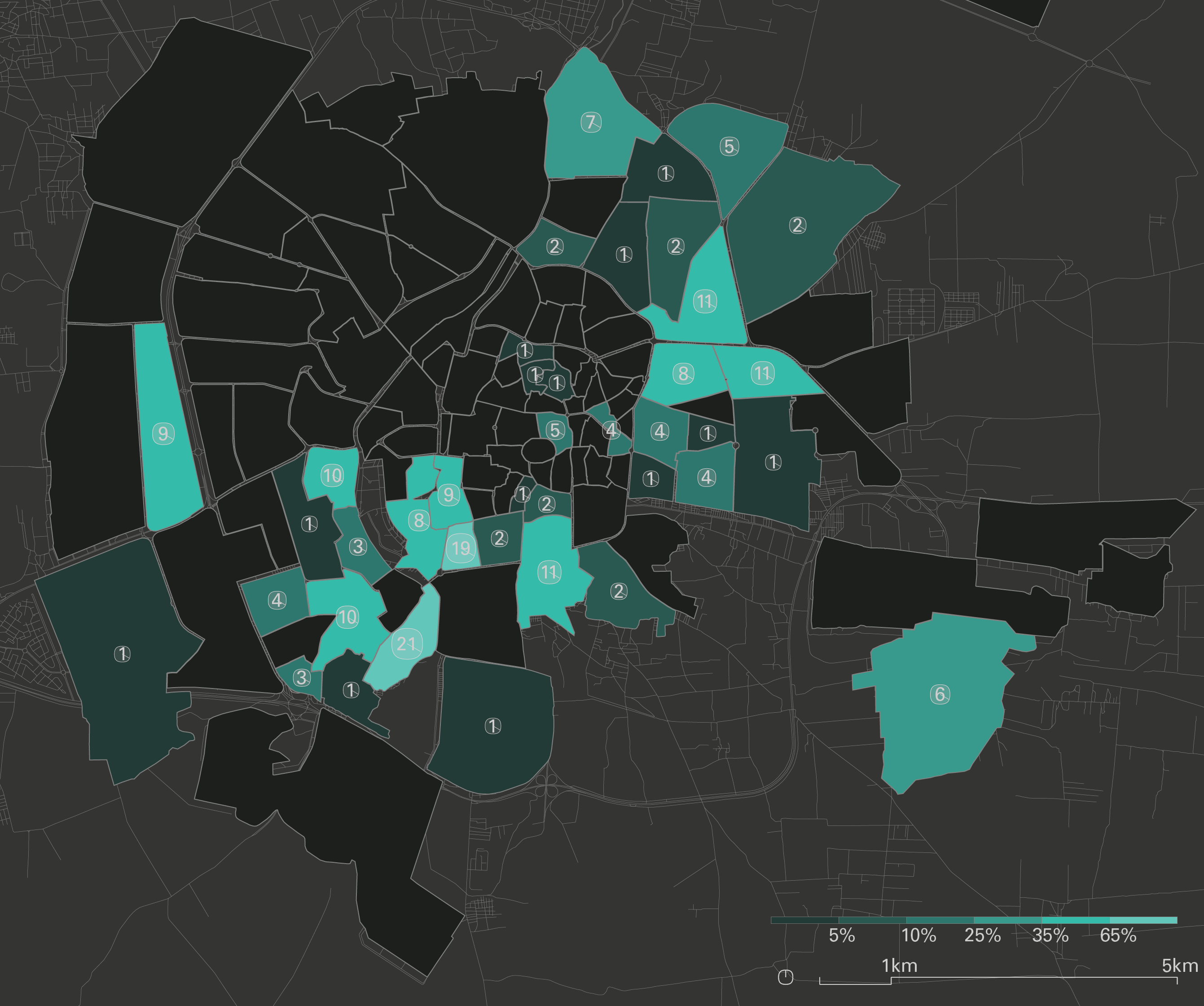
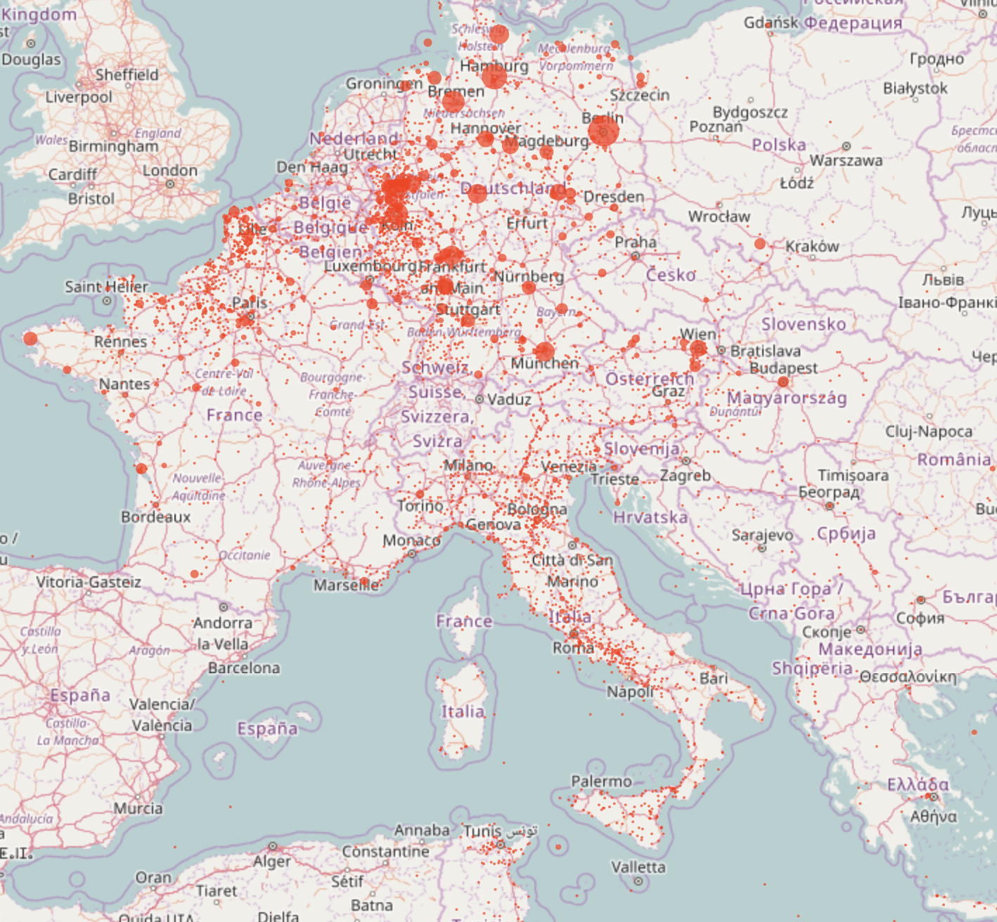
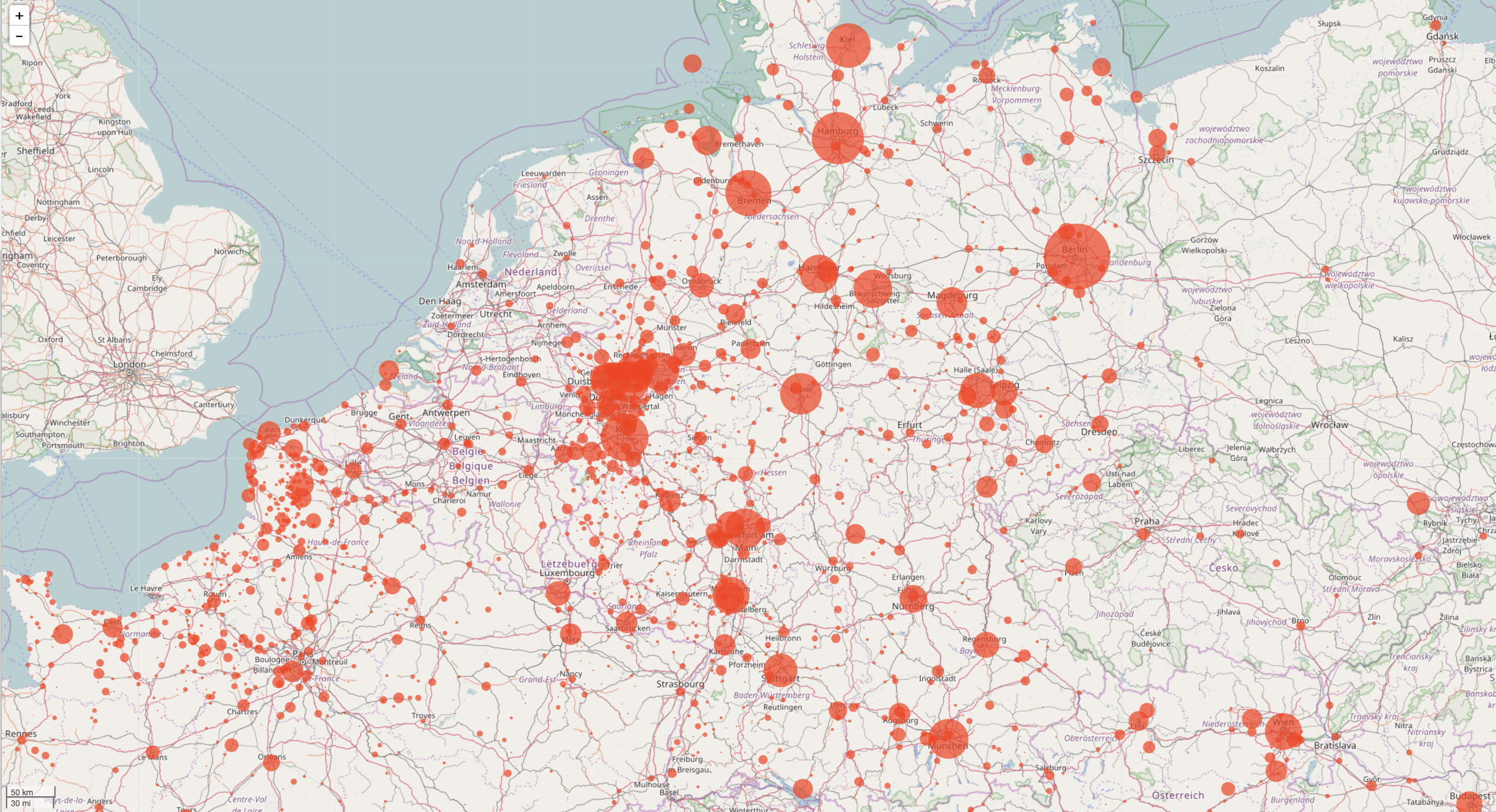
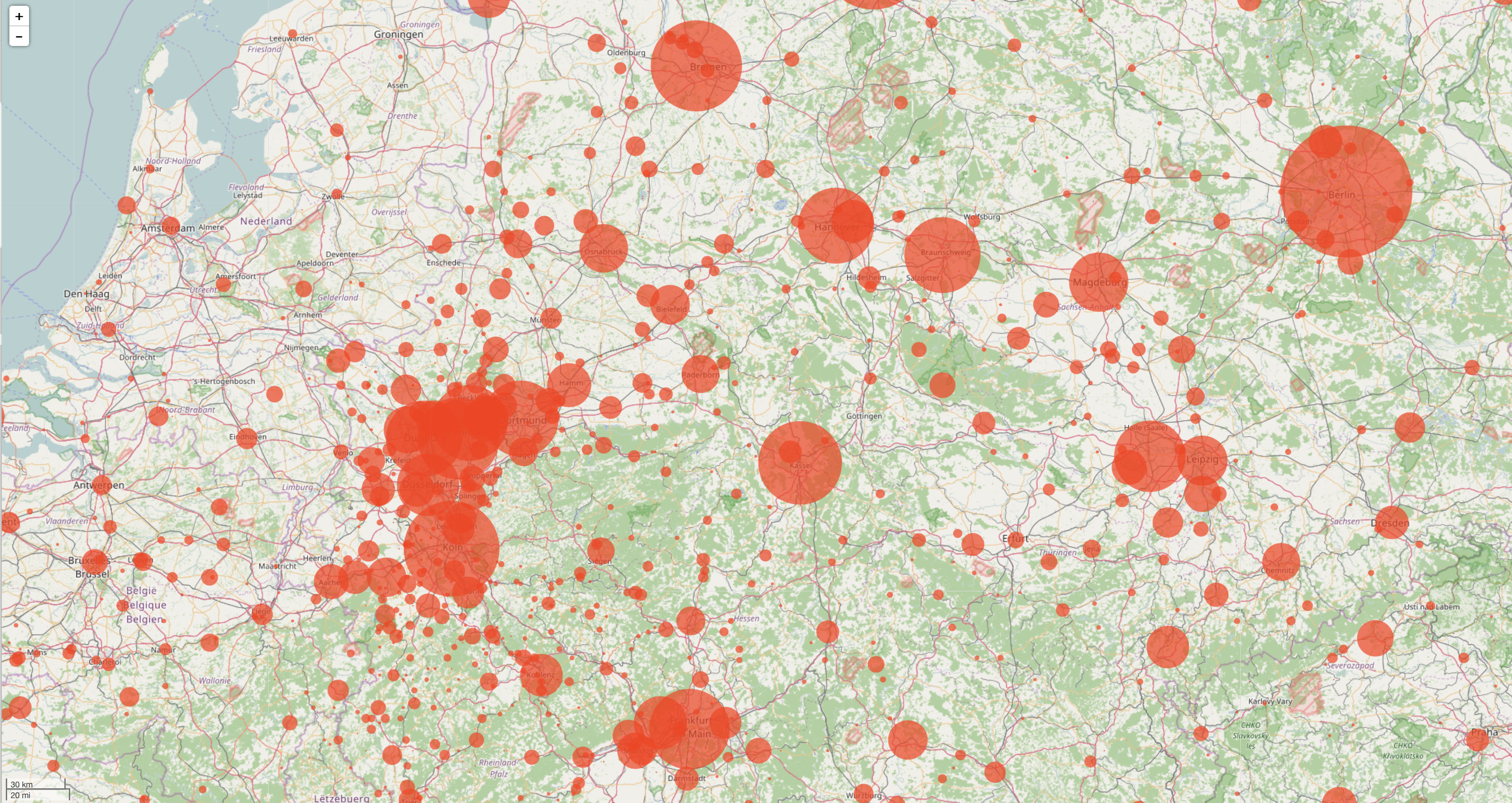
UPDATE:  I’ve since discovered this map of Allied bombing raids over Europe in the Second World War by Dimitri Lozeve, also drawn from Data.mil’s THOR database (click on the link for an enlarged version):

Allied bombing in Europe, 1939-1945

You can zoom in; here are two close-ups:

screen-shot-2017-01-18-at-12-35-23-pm

screen-shot-2017-01-18-at-12-38-26-pm

The map comes without a key; all I know is that the original tabulations include ‘U.S. and Royal Air Force data, as well as some Australian, New Zealand and South African air force mission’ 1939-1945 and refer to tonnages dropped: more discussion here.

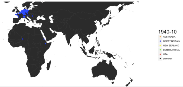
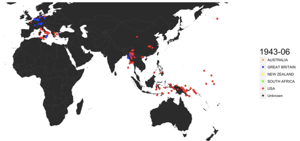
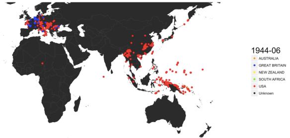
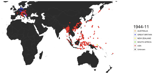
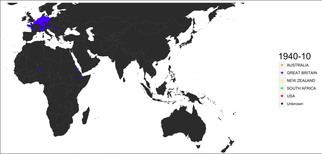
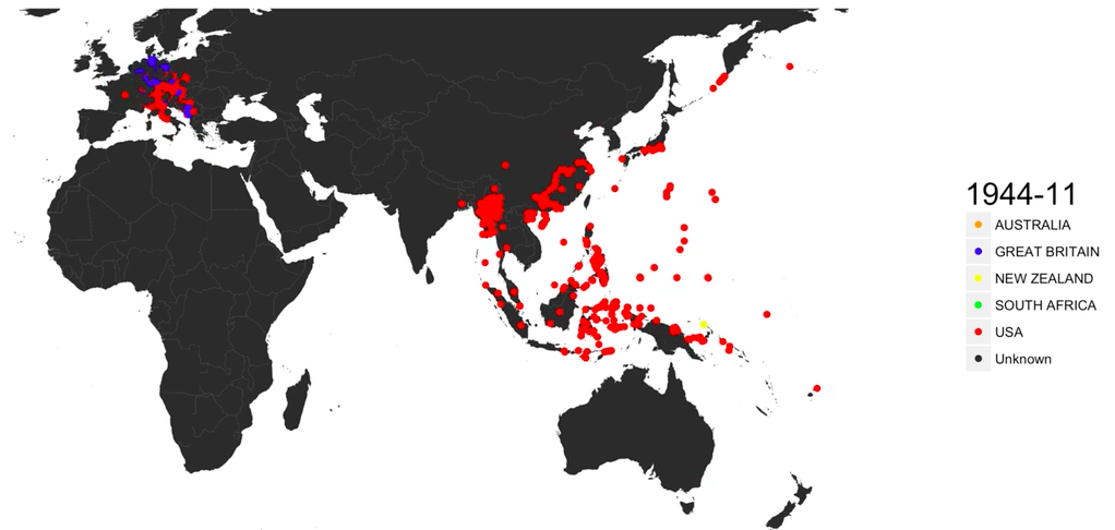
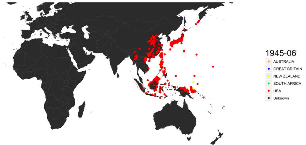
On the global scale, Data Is Beautiful has a GIF showing ‘every bomb dropped by Allied forces in World War II); you can view it as a video here, from which I’ve grabbed these screenshots that capture the shift from the European to the Pacific theatre:

allied-bombing-october-1940

allied-bombing-june-1943

allied-bombing-june-1944

allied-bombing-november-1944

allied-bombing-june-1945

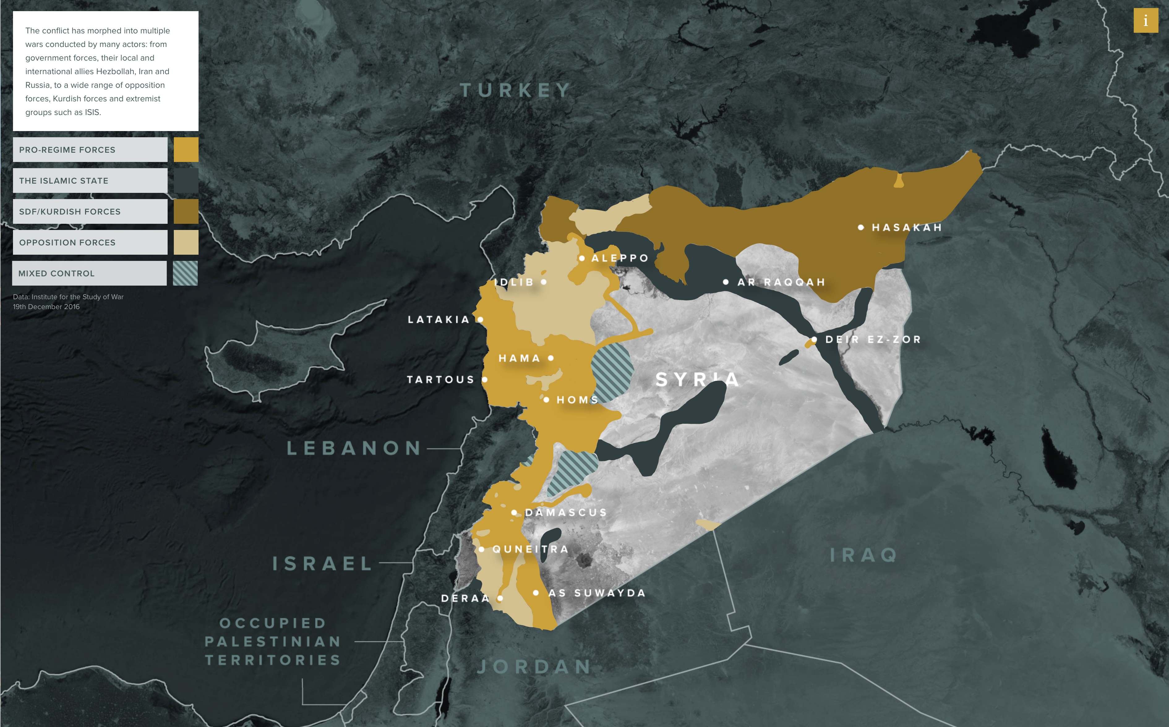
Data World‘s Ian Greenleigh has kindly alerted me to a similar treatment of the THOR database for Vietnam by his colleague Mark DiMarco here:

Our point-of-view is from high above the South China Sea, where much of the US Navy fleet was stationed.
By giving the user a bird’s eye view, we can clearly see up and down the Vietnamese peninsula, and the neighboring countries of Laos & Cambodia, and precisely see where these missions took place.
Each frame of the visualization is a single day’s worth of missions. Some days had as many as 1,500 missions, while the records for some days are completely missing.
The colors of each of the circles dictates what type of mission took place.

The GIF is here; screenshot from the interactive:

Vietnam bombing GIF

Empire, faith and war

My time in the archives at the Imperial War Museum this summer was very productive and I made considerable headway in completing my work on casualty evacuation from the Western Front in the First World War and from North Africa in the Second – more on that later.  In the letters and diaries written from Belgium and France I found many, scattered references to the presence of non-Caucasian troops, especially from North Africa and India; as I’ve noted before, it was not all white on the Western Front.


Soldier_map

But apart from the heroic work of scholars like Santanu Das there have been few attempts to piece these fragments together.  I’ve now discovered a website, Empire, Faith and War, that aims to put the contribution of Sikhs literally on the map (though it’s much more than an exercise in cartography):

As the world turns its attention to the centenary of the Great War of 1914-18, the ‘Empire, Faith & War’ project aims to commemorate the remarkable but largely forgotten contribution and experiences of the Sikhs during this epochal period in world history.

From the blood-soaked trenches of the Somme and Gallipoli, to the deserts and heat of Africa and the Middle East, Sikhs fought and died alongside their British, Indian and Commonwealth counterparts to serve the greater good, gaining commendations and a reputation as fearsome and fearless soldiers.

Although accounting for less than 2% of the population of British India at the time, Sikhs made up more than 20% of the British Indian Army at the outbreak of hostilities. They and their comrades in arms proved to be critical in the early months of the fighting on the Western Front, helping save the allies from an early and ignominious defeat.

Wartime generations and their stories fading fast, and current and future generations losing vital links to this monumental past.

There’s probably not a single Sikh in the UK who doesn’t have a military connection in their family history. It is often because of those links to the armies of the British Raj that many Sikhs now reside in the UK.

And yet the role of Sikhs in World War One is a largely unknown aspect of the Allied war effort and indeed of the British story.

By revealing these untold stories we aim to help shed much needed light on both their sacrifice, but also on the contribution of all of the non-white allied forces from across the British Empire.

This is possibly our last opportunity to discover and record the stories of how one of the world’s smaller communities played such a disproportionately large role in the ‘war to end all wars’.

Apoorva Sripathi has a good account of the background to the project here.

‘Empire of the Globe’

Klementinum Library, Prague

A quick heads-up: the latest issue of Millennium [44 (3) (2016) 305-20] includes Bruno Latour‘s, ‘Onus Orbis Terrarum: About a Possible Shift in the Definition of Sovereignty’, a keynote address that – amongst many other targets – goes after the globe and geopolitics….  To give you a taste:

To put it more dramatically, the concept of the Globe allows geopolitics to unfold in just the same absolute space that was used by physicists before Einstein. Geopolitics remains stubbornly Newtonian. All loci might be different, but they are all visualised and pointed to on the same grid. They all differ from one another, but in the same predictable way: by their longitude and latitude.

What is amazing if you look at geopolitical textbooks, is that, apparently, the Globe remains a universal, unproblematic, and uncoded category that is supposed to mean the same thing for everybody. But for me, this is just the position that marks, without any doubt, the imperial dominion of the European tradition that is now shared, or so it seems, by everyone else.

I want to argue that the problem raised by the link between Europe and the Globe is that of understanding, as Peter Sloterdijk suggests, why it is that the onus orbis terrarum has been spread so efficiently that it has become the only space for geopolitics to unfold. Why is it that the res extensa, to use a Latin term that pertains to the history of art as well as of science and of philosophy, has been extended so much?

Instead of asking what vision of the Globe Europe should develop, it seems to me that the question should be: is Europe allowed to think grandly and radically enough to get rid of ‘the Globe’ as the unquestioned space for geopolitics? If it is the result of European invention and European dominion, this does not mean that it should remain undisputed. If there is one thing to provincialise, in addition to Europe, it is the idea of a natural Globe itself. We should find a way to provincialise the Globe, that is, to localise the localising system of coordinates that is used to pinpoint and situate, relative to one another, all the entities allowed to partake in geopolitical power grabs. This is the only way, it seems to me, to detach the figure of the emerging Earth from that of the Globe.

Geopolitics limited to absolute space?  The Globe as the ‘unquestioned space’ for geopolitics (and a geopolitics that is indifferent to, even silent about ‘the Earth’)?  Really?

MINCA and ROWAN Schmitt and SpaceIn an interview with Mark Salter and William Walters, which appears as a coda to the issue, there is also a lot about Carl Schmitt and the Nomos of the Earth (and a pointed rejection of the interpretation offered by Claudio Minca and Rory Rowan), and this passage on drones that loops back to the discussion of sovereignty:

The point, I think, is that ‘sovereign’ has one very precise meaning, which is: a referee. So, is there a referee or not? In my understanding of Schmitt, in the two great ideas of his – the ones on politics and the ones in Nomos – there is no referee, precisely. And so, you have to do politics, which means you have to have enemies and friends. Not because of any sort of war-like attitude (even though there is some talk of that in Schmitt as well). But because, precisely, if you have no referee, then you have to doubt; you have to risk that the others might be right, and that you might be wrong. You don’t know your value; you are not in a police operation. OK, so that defines the state now, because the state goes, all the way down, to a police operation. If there is a police operation and not war, then there is a State, in some ordinary sense. That is how we can understand the first hegemon of the United States, entering the First World War as a police operation, no question. The drone, now, flowing over [and] … moving on top of the space of the land, is a police operation because the one who sent it has no doubt that he or she acts as referee. So, the first thing is to draw the extent of that hegemon. How we would do that, I don’t know. Certainly, there would have been a book by Schmitt a few days after the first drone, about this new definition of the State, extending above air its police operation everywhere.

Good knock-about stuff, but I’m not convinced about any of this either (and exasperated by the current preoccupation with the hypostatisation of ‘policing’)…

Base Nation

VINE Base Nation

Matt Farish‘s perceptive view of David Vine‘s BaseNation – ‘a distressing and tremendously helpful resource for grappling with the global geography of the American armed forces’ (see also here, the map here [also shown above] and the interactive map here) – is up at the LA Review of Books here.

Base-Nation1-243x366The Baseworld that was pieced together during and after World War II undoubtedly represented “a qualitative and quantitative shift,” but it is noteworthy that a place like Fort Leavenworth, Kansas, once dubbed the “western edge of civilization,” is today both a heritage landscape and an active Army facility, including, of course, the military’s most prominent prison. As historians have noted, the movement of men and motifs from the “Indian Wars” to overseas conflicts like the Philippine-American War (1899–1902) was direct. “Now that the continent is subdued,” the California-based Overland Monthly announced in 1898, “we are looking for fresh worlds to conquer.”

In the 21st century, the perverse demand for “total defense” has produced an increasingly diverse roster of base types, from Germany’s Kaiserslautern Military Community (including the massive Ramstein Air Base), home to an 840,000-square-foot mall, to the small, often secretive “lily pads” that typify the Pentagon’s role “in at least forty-nine of the fifty-four African countries. It may be operating in every single one.” By limiting the number of troops in place — sometimes replacing them with “pre-positioned” weapons and matériel — and encouraging closer ties with other national militaries, lily pads present a different sort of challenge for opponents of military presence.

But Matt – I think properly refuses the distinction between ‘domestic’ and ‘extraterritorial’:

Vine’s decision to focus almost exclusively on “extraterritorial” sites is practical, but it is also political, even as the division implied by this word is unsustainable. The benefits of its retention seem meager: it allows Vine to advocate for a return of “troops and base spending back to the United States,” “stemming the leakage of money out of the U.S. economy and ensuring that economic spillover effects remain at home.” Despite the stupendous number of dollars at stake — tens if not hundreds of billions, annually — I still wonder if Vine’s heart is really in this argument, or if he would prefer to emphasize the “twenty-first century form of colonialism” he documents in places like Guam, and the restitutions that might result from demilitarization. But even on this charge, he follows the same path, claiming that the condition of Guam or Puerto Rico hinders “our country’s ability to be a model for democracy.” For followers of popular political speech, this is familiar prose. But it is still a fictional aspiration, all the more frustrating because it seems to be the result of authorial or editorial pragmatism. It falls apart as soon as we consider varieties of ongoing military colonialism and environmental injustice in the American Southwest, for instance.

David has promised to donate all proceeds from Base Nation ‘to nonprofit organizations serving military veterans, their families, and other victims of war and violence.’

Tortured geographies

Guantanamo 'Suicides' In what now seems another life, I wrote about US torture during the early years of the “war on terror”, in ‘The Black Flag’ (which was specifically about Guantanamo, and which opened with three ‘suicides’ that we now have good reason to believe were anything but: see here and here) and ‘Vanishing Points’ (which extended the argument to Abu Ghraib and the archipelago of black sites like the ‘Salt Pit’ [shown below] within the global war prison).  Both are available in their original forms under the DOWNLOADS tab, and form part of the material I’ve been working with for a new essay to be included in The everywhere war.

Salt Pit

cia-report-p1-normalNow I’m digesting the Executive Summary that has been released by the Senate Select Committee on Intelligence on the CIA’s Detention and Interrogation Program, but you can download the original (redacted) summary here, ‘Other Views’ here, and the Minority View from the Republicans – and please God it remains a minority view – here.

The New York Times‘ coverage is here, the Washington Post‘s here, and the Guardian‘s here.

In the meantime, some of the best work on the dispersed geography of this vast apparatus was carried out by Trevor Paglen (see my updated discussion here).

map_paglen_emerson_r1_c1

Readers of his Blank spaces on the map will know of Trevor’s own attempt to see the ‘Salt Pit’ for himself, on the ground rather than from the air, and the images that result from this dimension of his work make clear – in plain sight, so to speak – their constitutive difficulties: see, for example, Jonah Weiner‘s essay on his work, ‘Prying eyes’, that appeared in the New Yorker here.

But here is part of what Trevor had to say about the mappings like the one above involved in his Torture Taxi and Terminal Air projects in An Atlas of Radical Cartography:

I’ve actually tried to stay away from cartography and “mapping” as much as possible in my work. The “God’s eye” view implicit in much cartography is usually not helpful in terms of describing everyday life, nor in describing the qualities of the relationships that cartography depicts. Because of what cartography cannot represent… it becomes pretty clear why it (and the forms of power that the cartographic viewpoint suggests) have traditionally been such powerful instruments of both colonialism and the contemporary geopolitical ordering of the world (which of course very much comes out of colonialism)…

I tend to be far more attracted to “on the ground” viewpoints and to embrace their fragmentedness and incompleteness. This project, as well as the “Terminal Air” project with the Institute for Applied Autonomy, are of course notable exceptions. With both of these projects that use the cartographic viewpoint, I was interested in taking what might seem like a familiar image and trying to and make it strange – trying to capture the feeling I had when I first started following CIA flights: it was the constant domestic flights to places like Tulsa, Las Vegas, Fresno, Fort Lauderdale and such that made a big impression on me. In working with John Emerson and the IAA, I insisted that we try to show a continuum between the domestic landscape and the landscape “somewhere else.” Neither of these projects are in my view not particularly useful as didactic tools but are instead useful in helping to see the point that we talked about above: that the “darkest” spaces of the war on terror blur into the everyday landscapes here “at home” and are in many way mutually constitutive. In this sense, they’re … images rather than analytic tools.

As I’ve noted before, this is part of the ‘capture’ side of the US kill-capture apparatus that uses drones (and often Special Forces) for the ‘kill’.  I say ‘US’, but it’s clear – not least from the map above – that a network of other states that radiates far beyond the other ‘Five Eyes‘ which have been so deeply involved in providing geospatial intelligence for drone strikes (and more) has been complicit in the production and concealment of this global archipelago of torture.

But there’s an irony in all this: even as the Obama administration ramped up drone strikes – and after a lull they have been resumed with a vengeance in Pakistan’s Federally Administered Tribal Areas – it was also condemning torture and, last month, committed the United States to acknowledging the extraterritorial reach of the Convention Against Torture (see Sarah Cleveland at Just Security here and Ryan Goodman and Eric Messenger here).  The refusal of the Bush administration to do so was a central part of the argument about legal geographies that I developed in both ‘The Black Flag’ and ‘Vanishing Points’.

So now we have an administration that recognises extra-territoriality to proscribe torture – and insists on it (or its own version of extra-territoriality) to authorise targeted killing.