The Tiny Apple

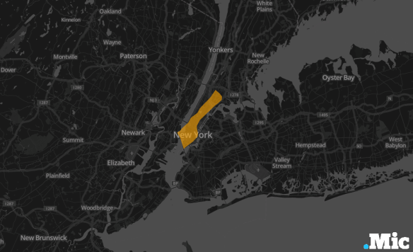
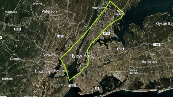
During the last week or so there have been several attempts to ‘bring Gaza home’ to New York. Chris Walker superimposed a map of Gaza on several major U.S. cities, including New York.  This is more artful than it first appears, since Chris has deliberately sought to show not the usual area for area comparison (the second map below) but rather ‘how much space is taken up by 1.8 million people’:

59c4c13bccfe9559c52e9284fd9a995f

newyork-6

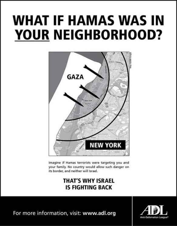
Transposition is a common tactic of popular geopolitics – it’s been widely used in commentaries on the war in Iraq in particular – but I’m in two minds about its political effectiveness.  Others clearly aren’t.  The next image is the Anti-Defamation League’s invitation to empathy (of sorts):

BsDEpU4CAAAP6LC-1

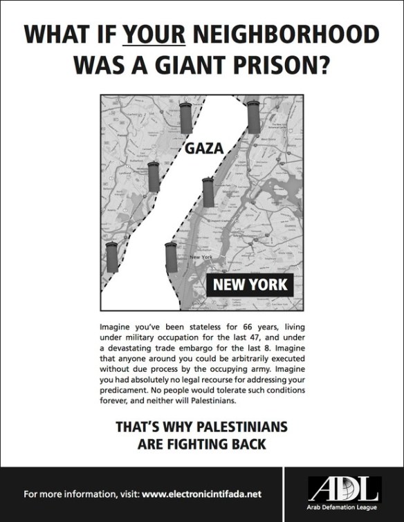
It elicited this response from Daniel Sieradski:

prison

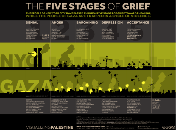
But perhaps the most powerful comparison between New York and Gaza is the latest info graphic from Visualizing Palestine on ‘the five stages of grief’: it’s effective, I think, because it’s original and you have to take your time over it.  And anything that encourages people to take time for Gaza and its people is worth it.

Five Stages of Grief

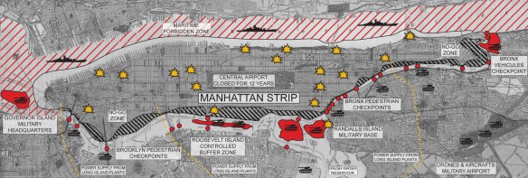
UPDATE: I’ve just had a kind note from Léopold Lambert reminding me of his ‘War in the Manhattan Strip’ that he published on the Funambulist a couple of years ago; I recommend reading the accompanying text….

Manhattan Strip - Map by Leopold Lambert


Maps of/for pain

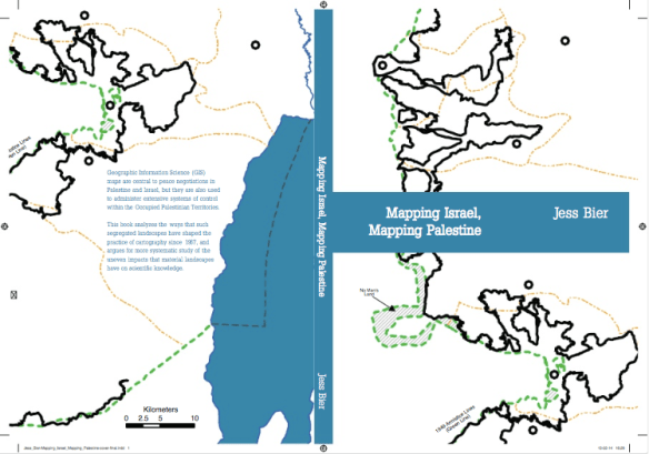
This morning I received a copy of Jess Bier‘s recently completed PhD thesis, Mapping Israel, Mapping Palestine (Technology and Science Studies, Maastricht, 2014) – thanks so much, Jess – and I look forward to working my way through it.  You can download a version from Academia here.


BIER Mapping Israel, mapping Palestine

Here is the abstract:

Mapping Israel, Mapping Palestine is an analysis of the ways that segregated landscapes have shaped the practice of cartography in Jerusalem and the West Bank since 1967. Extending work on how technology is socially constructed, it investigates the ways that knowledge is geographically produced. Technoscientific practices are situated in spatial contexts which are at once both social and material. This situated character influences the content of knowledge in ways that can be unpredictable. Therefore, it is necessary to reflexively engage with materiality in order to enable landscapes that allow for more diverse practices and forms of knowledge.

The complex geographies of Palestine and Israel provide central sites for the study of how landscapes shape the form, content, and circulation of knowledge. 1967 marks the beginning of the Israeli Occupation of the Palestinian Territories, including the West Bank and Gaza Strip. With the notable exception of East Jerusalem, currently most of the occupied areas have been neither formally incorporated into the Israeli state, nor have they been allowed to form an independent sovereign nation. Instead, small pockets of Palestinian control have been carved out through a series of international negotiations aimed at clearly defining separate states for Palestinians and Israelis—negotiations which often take place over tables strewn with maps.

Yet even as maps are employed in attempts to end the Occupation, similar methods have been used to build intricate infrastructure networks for curtailing human movement within the Territories. These include the 8‐meter [high] Wall which snakes through the West Bank, segregated sets of roads and buildings, as well as roving series of checkpoints and roadblocks, all designed with the purpose of confining Palestinians and separating them from Israelis. The planning, construction, and administration of such systems of control are made possible by the same Geographic Information Science (GIS) mapmaking practices which are used in attempts to ameliorate the conflict. To understand how this is possible, it is necessary to explore the ways that such practices are differently incorporated throughout the very region which cartographers seek to map and reshape.

The centrality of maps to debates over the future of Palestine and Israel has only intensified since the advent of digital cartography has led to increasingly minute forms of surveillance and control. Contemporary cartography incorporates a range of practices in Jerusalem and the West Bank, from adaptations of decommissioned spy satellite images to a road map made by Palestinian students who tracked their own movements on their mobile phones. Intended to display objective facts, empirical maps often inspire extensive discussion. Participants in these discussions exhibit a variety of observational frames that cannot be divorced from their unequal positions and mobilities within the very terrains that they seek to portray. Mapping Israel, Mapping Palestine addresses these issues by presenting an analysis of the empirical maps and mapmaking practices which result when diverse cartographers travel to chart the same landscapes that so condition their movement. As such, it investigates the myriad ways that the segregated landscapes of the Israeli Occupation shape the conditions of possibility for knowledge about the Occupation and its effects.

This is really important work (see also the presentation by the Foundation for Middle East Peace here), but in addition to maps and digital captures of occupied Palestine – the plethora of lines on maps – there are other operational dimensions to mapping.  I’m thinking in particular of the IDF’s target maps.  You can find a report of its ‘target bank’ for southern Lebanon in 2011 here – ‘many time larger than it was in 2006’ – and Craig Jones‘s discussion of surveillance, imagery and targeted killing here.

This apparatus is in full play during the present military offensive on Gaza, which (like all the others) involves the production and destruction of targets through the mobilisation of cartography.

But there are other dimensions.  Here is a senior IDF officer, as reported by Reuters on 12 July:

“We are dealing with a variety of families of targets. If there is a kind of a map, or a map of pain that the enemy sees, we create a lot of pain so that he will have to think first to stop the conflict.”

There may well be a map of pain — but the pain is also produced through mapping.

Bethlehem to Baghdad

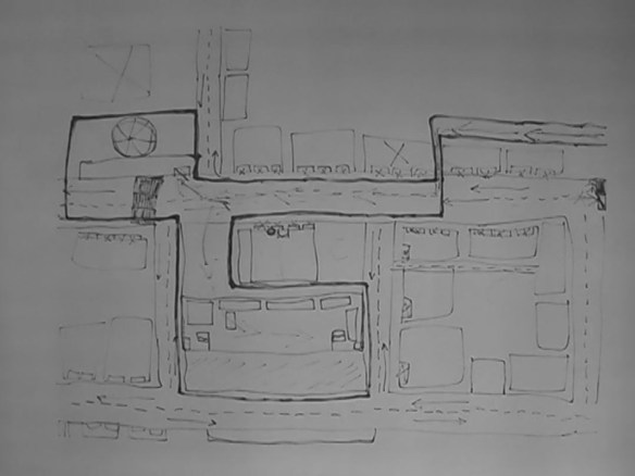
In 2008 the artist Till Roeskens – who describes himself as an ‘amateur of applied geography’ – produced a ‘videocartography’ or ‘videomapping’ based on interviews at the Aida refugee camp in occupied Palestine.  Roeskens explains: ‘I asked residents of the camp to draw with big ink pens so the marks would go through the paper. I filmed from the other side, as they drew, so I didn’t see the person while they were drawing and speaking; I saw only the white screen with the light coming from behind me.’  The mappings, together with the stories told by those who drew them, were recorded on video, and ‘as the film progresses, the viewer is increasingly hemmed in by a complex network of lines, until the reality of the occupation is fully realized on screen’.      There is a revealing interview with the artist at Words without borders here, and you can watch some extracts here (and there are others on YouTube and vimeo).

« On screen: nothing but another screen. At first untouched, a blank sheet of paper is slowly being filled with more or less straight lines. Then these lines grow, push and cross each other, to finally form a drawing, a layout; they unfold a topography, mark places, build houses, give directions, describe in great detail tangles of roads and obstacles. In fact, they are laying down flat biographies. Six sheets slowly come to life that way, one after another, following the rhythm of stories told by children, women or men voices, of people we never get to see. Where are these voices? Behind the sheets. Of course, but where else? Nowhere: that is precisely what the voices are trying to say. Or rather, because even nowhere persists on taking up some space, they say that they are in Palestine. (…) »

Inspired by Rosekens’ work, Antonio Ottomannelli transposed the technique to Baghdad.  The project was carried out between November 2011 and February 2012 with students at the Fine Arts Faculty of the University of Baghdad.  Ottomannelli:

‘Baghdad is a hidden city.  Everything is placed behind anti-explosion walls, from one checkpoint to the next. … The latest map of Baghdad was made by the US military in 2003 for military and strategic purposes…  There is no civilian map of the current configuration… Inspired by the work of Till Roeskens on Palestine, Mapping Identity tries to tell about the city – the whole of it – from the inside.  A snapshot of the ordinary, a minor “Giacometti portrait”, as Baghdad is concealed…’

More details here, and a videomap here (more on vimeo).

These projects are political-artistic versions of the ‘mental maps’ that captured the imagination of many human geographers in the 1960s and 70s – an interest which is usually traced back to Kevin Lynch’s experiments with The image of the city (1960) and that probably climaxed in Peter Gould and Rodney White’s classic little book, Mental maps, originally published in 1974 – but what makes these projects so compelling is their emphasis on the process of mapping (through their use of video) rather than a fixation on the map as finished object.  One of the criticisms of the original ‘mental mapping’ projects was that respondents drew maps only because they were asked to: that this was not how people found their way around their neighbourhoods, which usually turned out to be a much more pragmatic, improvisational practice responding to cues and following routines rather than relying on some imaginary point of overview.  But these two projects are ways of narrating a space – of telling what Michel de Certeau would call ‘spatial stories’ – that are also interventions in (and subversions of) larger narratives of military violence and military occupation.

Vancouver as the centre of the world

No, I know it isn’t – though many people who live here evidently think otherwise – but on the first full day of the London Olympics it seems appropriate to re-visit Landon Mackenzie’s Vancouver as the centre of the world, a remarkable (and huge) work commissioned by the Vancouver 2010 Cultural Olympiad.
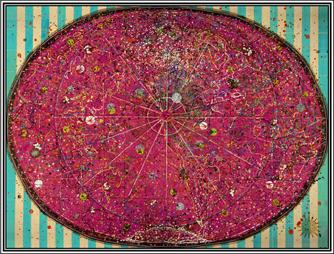
 

This may seem a world away from my current preoccupations, but it isn’t – in all sorts of ways. Robin Laurence described the work ‘as a complex metaphor of power, place and ethnocentricity, the painting throbs with meaning. Throbs with menace, too. Those wine-red splatters look a lot like blood.’

‘On first viewing, Vancouver as the Centre of the World looks abstract—an enormous red oval floating on a ground of blue-green and sandy-ochre stripes. In fact, the work is highly representational, its variously translucent and opaque washes of colour inter-layered with subtle forms and ambiguous lines. Alluding to the formal problems posed by creating a two-dimensional map of our three-dimensional planet, and the weirdly distorting cultural biases of cartographers past and present, the painting folds references to moons, satellites, time zones, Internet cables, shipping lanes and airline traffic into its teeming surface. It also focuses us on the geopolitical forces that shape our vision of the world.

‘“It’s about the creation of a complex fiction,” Mackenzie says, pointing to the midden-like heap of maps that went into the painting’s making. Oceans and landforms shift and merge, national boundaries are erased, and cities like Buenos Aires, Hong Kong and Timbuktu rotate around the place that was once the end of the Earth.’

There’s also an excellent interview here with Didier Bigo, from Cultures et conflits, in which Mackenzie talks about her cartographic obsessions:

I liked the idea of this presentation because in reality all maps are a construction and a kind of fiction. In the late nineteenth century the Olympics became re-organized under nation states and so to erase national boundaries symbolically was a simple way of commenting on this relationship in contrast to most maps or globes which show a colourful spectrum of individualized territories.’

My own cartographic obsessions are rather different, as I’ll explain in another post, but I’m particularly interested in these marchlands between cartography and art.  Alan Ingram’s more general work on art, geography and war – he explains the inclusion of the middle term here – is exemplary.  In my own case, ever since I encountered elin o’Hara slavick’s “Bomb after Bomb” (see ‘Doors into nowhere’ in DOWNLOADS), I’ve been drawn to the work of artists who, like her, work to both reveal and subvert the spatial-visual logics that make possible the targeting that is the dead centre of military violence.  I’m most interested in ‘aerial works’, and I now have a long list that includes Martin Dammann [the Überdeutschland series], Joyce Kozloff [‘Targets’], Raquel Maulwurf, Gerhard Richter, and Nurit Gur-Lavy, and I’ll say more about them shortly.   But if anyone else has others I ought to include, I’d be very pleased to know of their work.